 Mobility
Recently, an article in the Financial Times explored the pandemic-related global decline in transit ridership and warned that commuting patterns might never recover.
If your work involves decisions related to human mobility, you’ve no doubt been challenged by the uncertainty of this year. From infrastructure planning, transit operations and public policy, organisations everywhere have struggled to effectively plan for the future based on precedent from a very different past.
The time-series chart below shows the trips taken by people within Germany since January 1st, and captures what we’ve all been dealing with in 2020: two major cycles of pandemic-related public policy measures, combined with atypical seasonal travel have caused 2020 to look different than any other year in recent memory.

Before I started as Chief Product Officer for Teralytics in February, customers had been using our flagship product Matrix to understand where, when, why and how people in their region were traveling. As the COVID-19 pandemic quickly spread worldwide, my priority was to find a way to turn a tool, which was already world-class in terms of representing accurate snapshots of human mobility, into one that would help our customers better manage through unprecedented volatility in human mobility.
As a result, our roadmap became heavily geared toward adding context and timeliness to the mobility insights we were already providing. When our March data started to show dramatic fluctuations in travel, we launched a daily refresh to our datasets, which allowed our customers to track pandemic-related changes in near real time. Then, to help organisations understand how data from yesterday or last month relates to previous periods, we added a comparison capability in May, which allowed users to compare and visualise two sets of data side-by-side.
Feedback showed that users appreciated the ability to understand current mobility in context, but some commented that comparing only two periods wasn’t enough for them to see a larger pattern. We responded by making it easier for users to bulk-export several periods of data at once, but we suspected we needed to do more.
Through interviews about their use of our multi-period export, we found that several customers were bulk-exporting 12-18 months of data in order to analyse trends over time. Some were spending days working with this data in tools like Excel or Tableau before attaching charts to their stakeholder reports and presentations. Many of them mentioned that limitations in their tools made this process extremely frustrating.
Based on this feedback, we developed a product that would help customers make good decisions amidst an uncertainty in human mobility that is likely to persist. We looked for capabilities that would show patterns in human mobility over time, add context to outliers and anomalies, and clarify the meaning of the data while making it easy for users to communicate this information to their stakeholders.
Today, we’re launching Matrix Trends as an add-on to Matrix. Our first version of the product is built around the following five key capabilities:
Timeline: an intuitive way to explore data patterns and view summary statistics for the time periods of your choice. As you drag the time range to shrink or expand it, charts and statistics update in real time. More than just a date selector, vertical bars in the timeline indicate relative trip volume per period for your selected region and filters.

Forecasting: while 2020 has shown how uncertain the future can be, the quality and volume of Matrix data is a solid foundation upon which to reasonably project what might be. But instead of a linear projection, Trends incorporates an open source library that was trained by machine learning methods at Facebook to forecast cyclical data. When you want to generate a forecast, simply select a future date in the timeline.
Time-series charts: Trends time-series charts help you see fluctuations in human mobility over time. Charts are generated for the time period you select, but also for the regions and filters you set in Matrix. Depending on the data set used, time series charts are available for a variety of attributes such as total trip volume, mode of transport, trip type and purpose.
![]()
Chart Summaries: since making sense of billions of data points is tough for any human, we built Trends to do some of that work for our users. Accompanying most time-series charts are short summary statements which highlight in simple language some of the primary implications of each chart. As you change the date range or filters, these summary highlights also update to reflect your new frame.
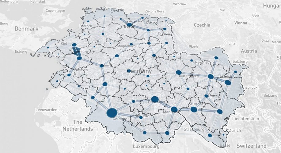
Flow Animation: because Matrix is all about human mobility, it seemed only appropriate to show movement in motion. The first implementation of our flow animation is essentially a video playback of millions of human trips in your selected region to help you and your stakeholders experience human movement in an engaging way. We’re eager to expand on this in coming releases.

These are the capabilities available at launch, and there’s more to come. In order to deliver value to our customers as soon as possible, we think it’s important to release initial features quickly while iterating on enhancements.
Exciting new features in the next releases will include email alerts notifying users of mobility anomalies in their region. In addition, Trends will make it easier for users to communicate with their stakeholders through extended sharing capabilities (chart and image export), and custom annotations for charts and flow animations.
As we look beyond one of the strangest years in history to a future that still feels uncertain, we hope that Trends will enable customers to make sense of it all, to react quickly, and stay one step ahead.
Find out more about how Teralytics Matrix Trends can help you.